
The Challenge
Although The Church App by Subsplash has included a digital Bible since its inception in 2016, there isn't a way for churches to natively include custom Bible study content in their church app.
The Opportunity
Recognizing this gap presented an opportunity to enhance user engagement by providing a customizable approach to corporate scripture interaction within the app's ecosystem.
The Result
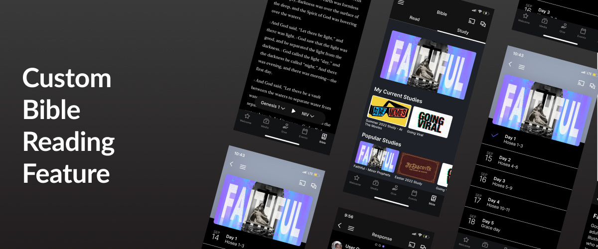
A custom Bible reading feature that integrated with the existing infrastructure and leveraged
Tools: Figma, Subsplash App Platform, maze.co, Google Workspace
Roles: Product Design, UX Research

Empathize with the user
Research Objectives
For two years I worked as an Onboarding Support Specialist for Subsplash, so I knew I had my own bias about this feature. I knew my research would be key in getting beyond my bias and truly empathizing with the user. So I created these research objectives to guide my research:
1. Determine the user's need for a Bible reading tool
2. Determine if a Bible reading plan is an effective or desirable discipleship tool; to match the business goals.
3. Understand what current digital solutions for Bible reading plans are being used by churches or individuals.
4. Highlight the gaps between the existing Bible Reading Plan tool’s abilities and the real-world needs.
5. Account for the differing needs of a client (church) and an end user.
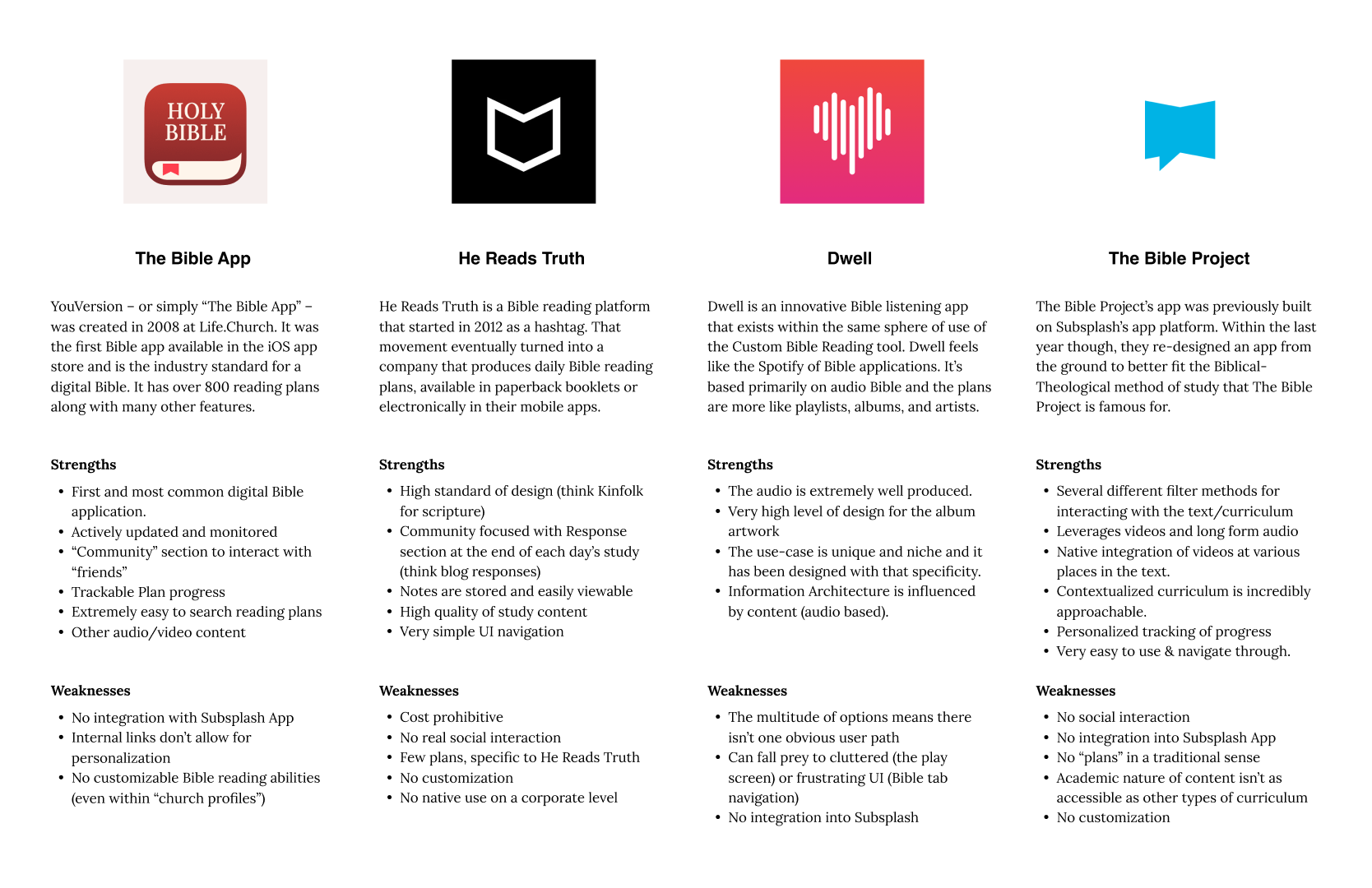
Comparative Analysis
The Subsplash App Platform is an all-in-one app solution. While there are several main competitors in the “church app platform” market, none have a native Bible or Bible Reading Plan tool. Therefore, I had to look to the current solutions at play in the marketplace for corporate Bible studies and reading plans.
Survey
To comprehensively understand users' engagement with app-based Bible Reading Plans, I initiated a survey using Google Forms to collect quantitative data on their technological interactions with scripture. The survey remained open for four days and was distributed across my social media platforms. In total, it garnered 56 responses. Notably, 94% of respondents identified themselves as regular church attendees, defined as individuals who attend church at least three weeks per month.

User Interviews
After completing the surveys, I wanted to explore the narratives behind the quantitative data. I Interviewed three individuals with experience both as users and creators of Bible reading plans. While the organizational aspect fell beyond the immediate scope of this project, I chose to lean into it slightly with the interviewees to gain additional insight while maintaining a primary focus on the end-user experience.
How might we help users engage scripture together inside their church’s Subsplash app?

Define the problem
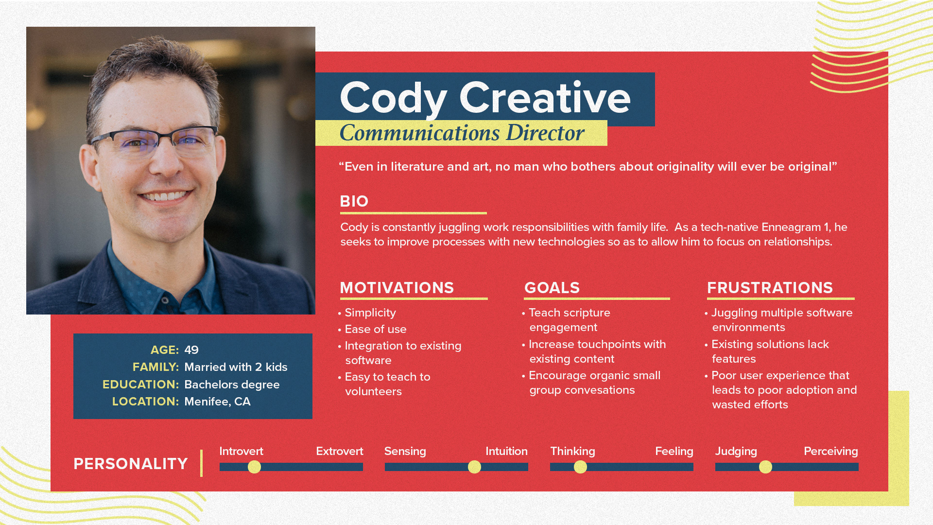
User Persona
Say hello to Cody! My user persona, based on the research above. Cody likes the idea of the improvement to the Church app that he already uses to engage his church’s content. But he has some concerns that I need ot take into consideration while designing if I’m going to create an effective solution.
Product Roadmap
Now that I have my persona, I prioritized the project’s potential tools in order to create a minimum viable product that addressed Robert’s goals, motivations, and frustrations.

Existing User Flow
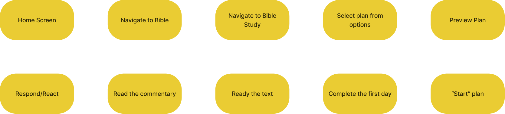
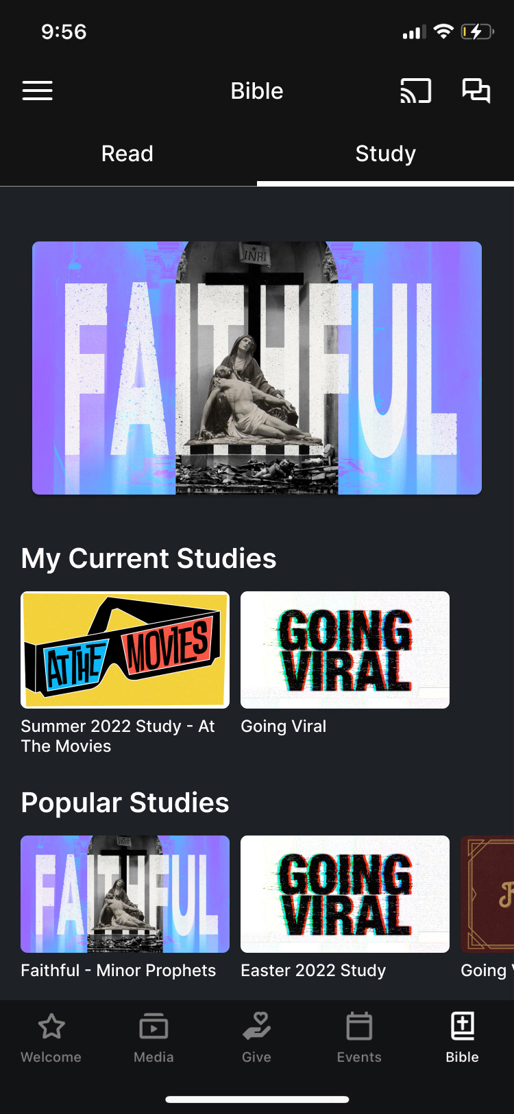
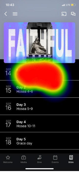
The current user flow includes a generic Bible reading plan and few churches utilize it in any organized or intentional corporate way. As it is now, users navigate to the Bible tab and click on “Plan” to read the exert for the day. No interaction, no commentary, and no customization for the church.

Proposed User Flow
The new custom Bible reading plans would require several more steps in the user flow to unlock all the potential custom content put out by the church or added to the library for end users’ use.

Ideate potential solutions
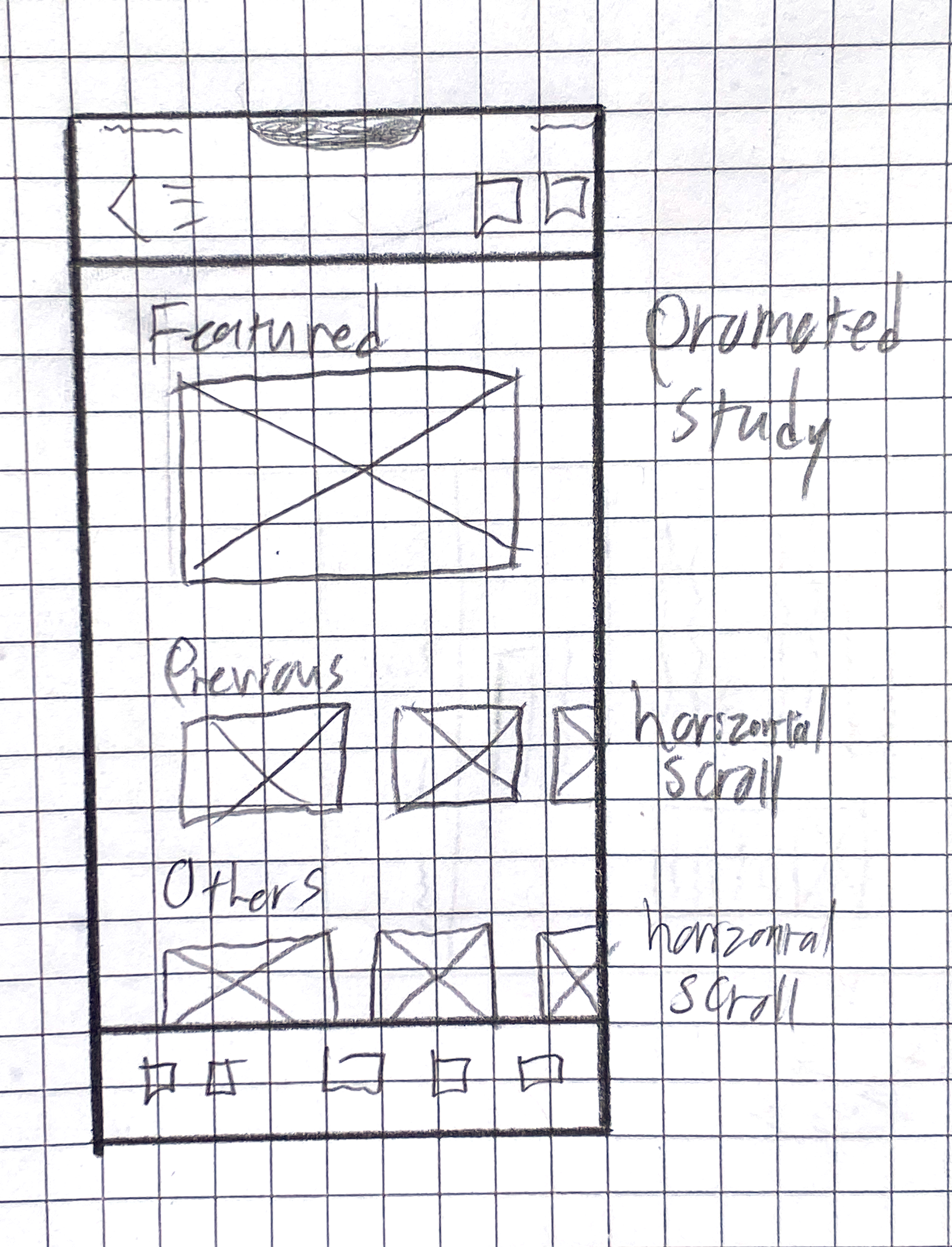
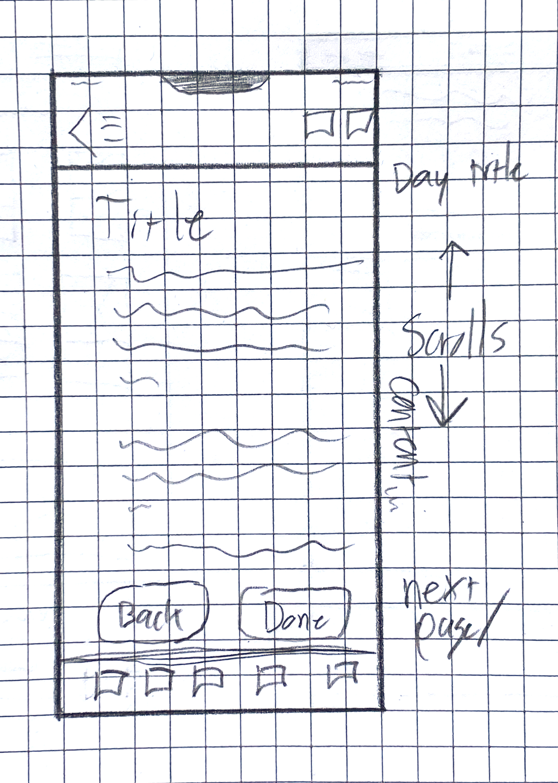
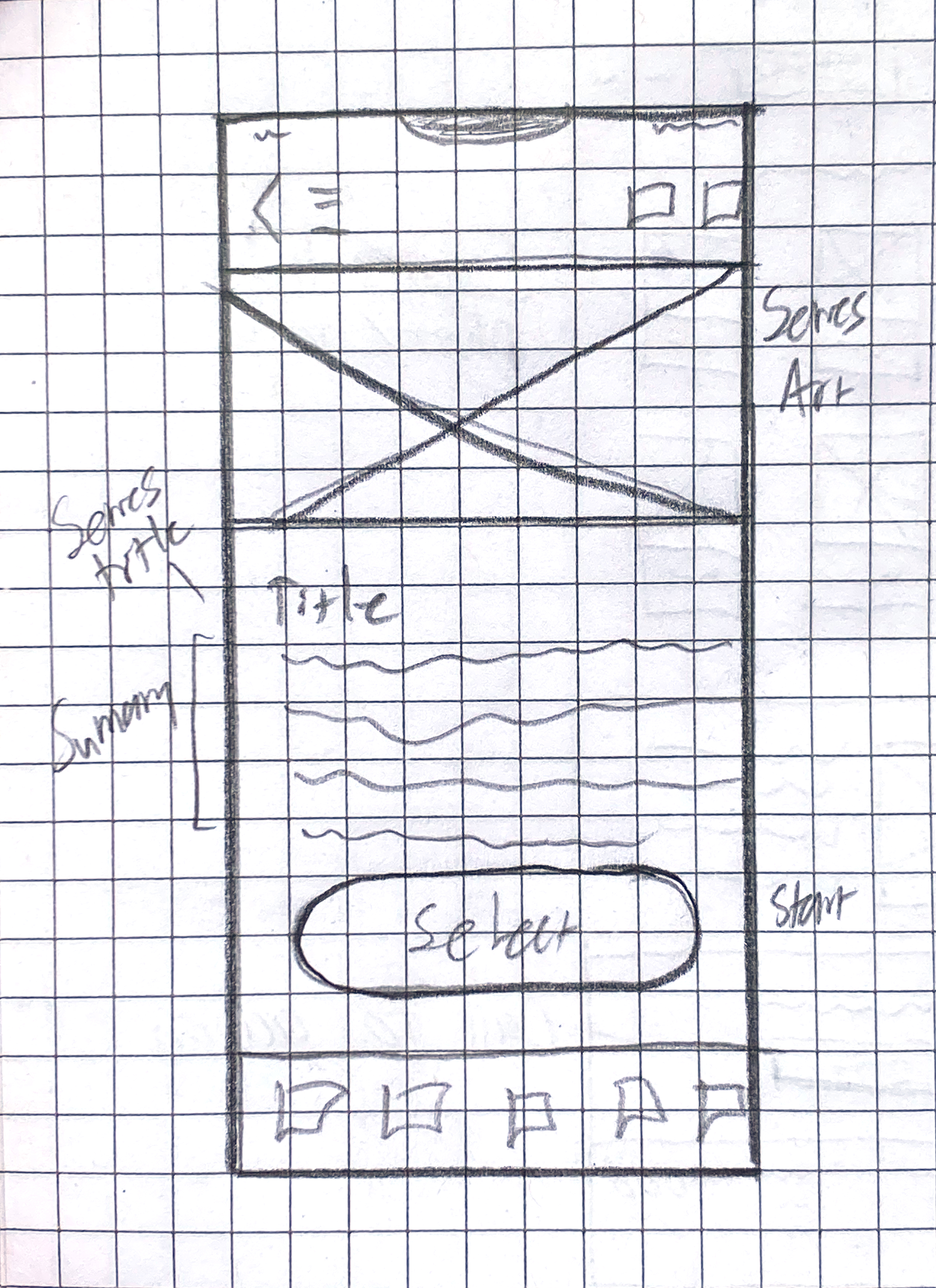
Sketches
I knew much of my design would be coming from the existing UI that is used throughout the Subsplash App. Still, some elements needed to be created from scratch or needed to be combined in new ways. So to begin the iteration, I sketched some wireframes.
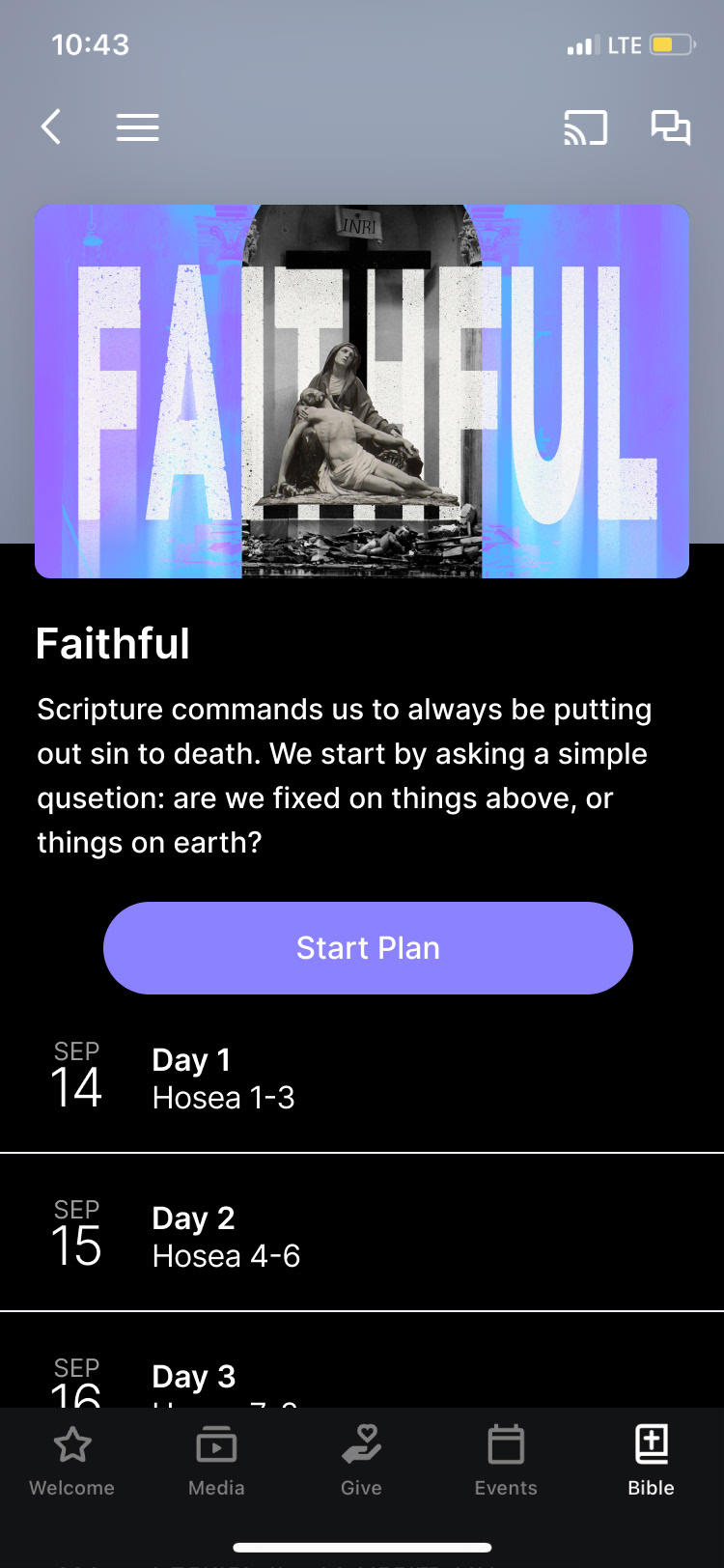
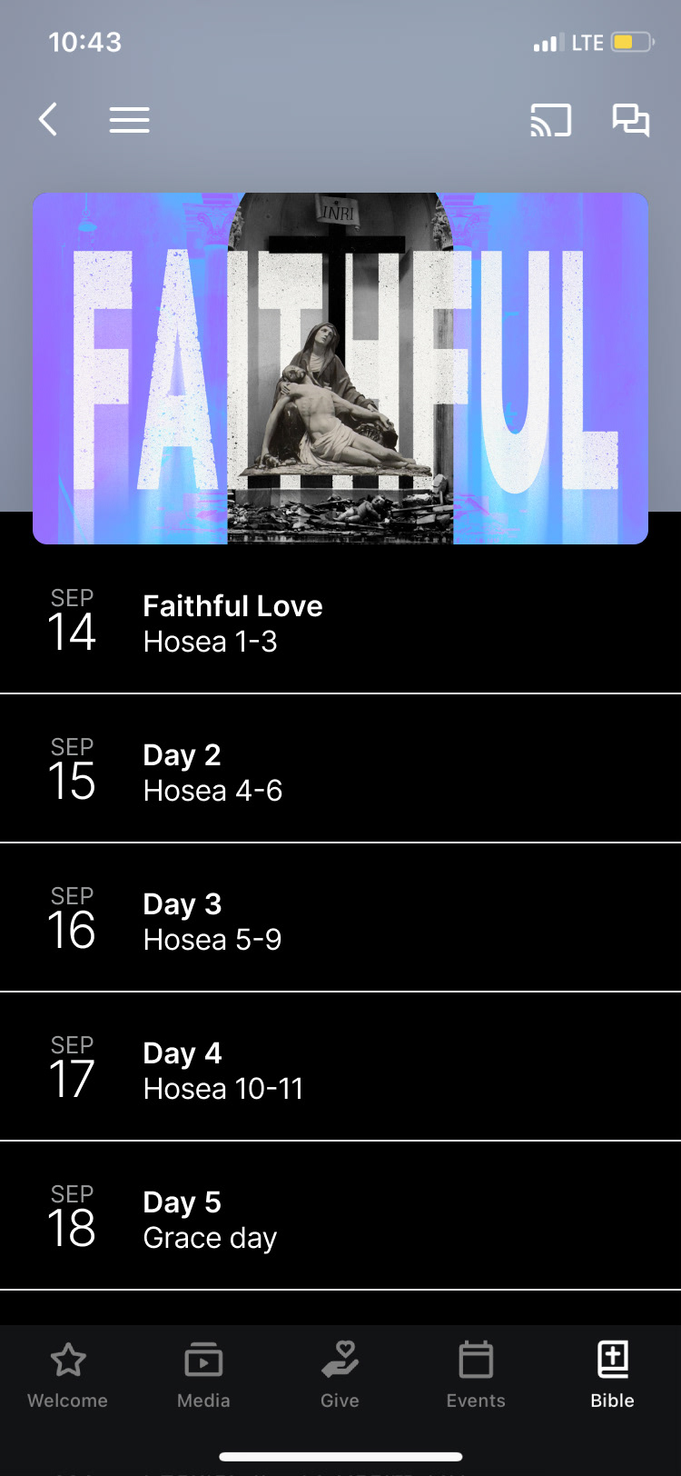
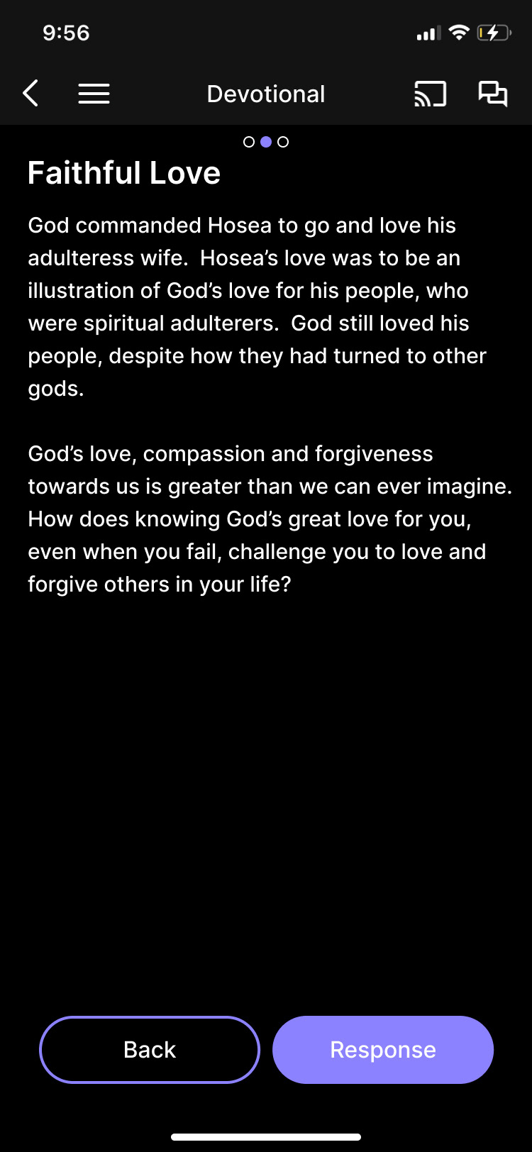
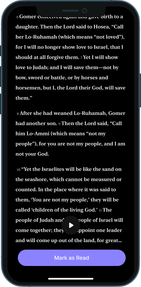
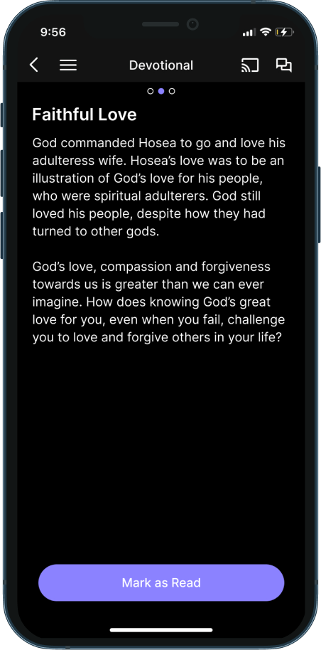
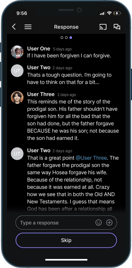
Hi-fi Mockup
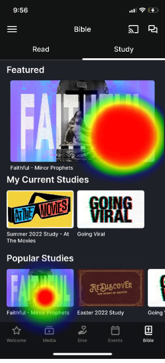
With a rough idea of the design, I created hi-fi mockups in Figma. Leveraging the existing UI library that appears elsewhere in the Subsplash ecosystem so this feature can seamlessly be added to any Subsplash app.
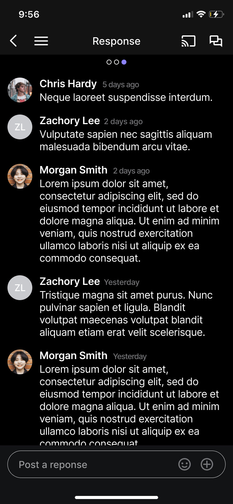
For example, the color of the buttons, carousel, and background blur would be taken from the Study Plan artwork, just like it is in the “Media” tab elsewhere in the app. The Response page would also be built off of the existing “Messaging” infrastructure inside the Subsplash App.

Test to improve
User Tests
The testing phase was what I was most excited for. Again, acknowledging my own bias throughout this entire project, it was time to release my work to the wild to see how it performed.
The test I created consisted of 2 “tasks” and 7 questions about the user’s experience, opinion, and reaction to the prototype as a whole or specific pages. I sent the test out to the people who previously completed the survey and I got 11 respondents that completed the entire test.
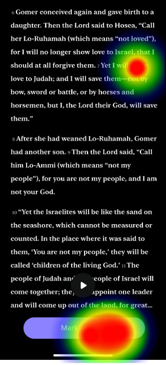
For the most part, the test went well! Users were able to navigate through the entire prototype with ease. The screen I expected to cause the biggest issue was the “Plan Selection” page, but most users natively knew how to navigate that screen.
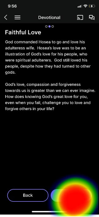
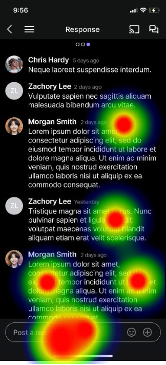
Surpassingly, the biggest user issue presented on the Response page. Now, these results need to be taken with a grain of salt because some of the interactions that were counted as “mis-clicks” cloud have been users attempting to scroll. But in response to several questions, the Response page was mentioned with one user saying “It wasn’t clear that I had to make a response.”

Iterate to excellence
Iteration
To improve the interaction with the Response page I took a look at the navigation through the entire plan. The “Back” button that I had added to the Reading page and the Devotional page was superfluous because of the native back arrow that is already present throughout the entire app. Removing the “back” button also lets me keep the “Mark as Read” button consistent across screens. This consistency leads the user to have a better expectation of where to look for interaction on the Response page.
Instead of a primary button on the Response page, I kept the text input box, but I also added a secondary button so users who didn’t wish to post a reply could still complete the day’s reading and receive the completed check for that day’s study.
Finally, I also added a swipe interaction between the pages of the Reading Plan. Several comments in the User Testing said they expected that ability to navigate, and I have seen multiple other Bible reading apps use that functionality during the comparative analysis, so not only is it an industry standard practice it is also present in the Bible reading tab in the Subsplash app, outside of the reading plans.

Conclusion
Undertaking this project has been incredibly fulfilling. Developing a feature I've envisioned for years has been a rewarding experience. Despite my evident bias, I am confident that many users will find value in this digital Bible reading tool, as evidenced by the presented MVP solution. Moving forward, I would prioritize returning to user testing to refine navigation clarity and interaction on the Response page.
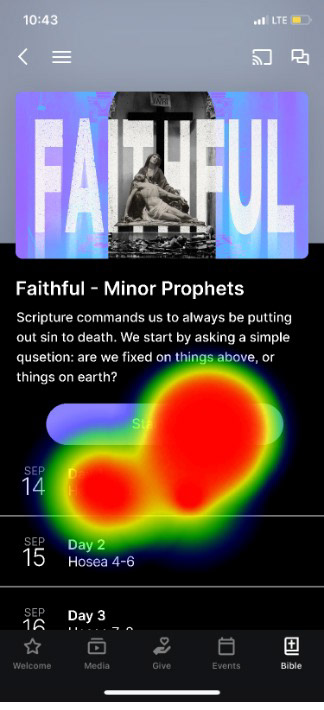
Additionally, I aim to address the challenge of elevating the visibility of this feature within the app. Currently nestled within multiple layers, I am convinced that straightforward solutions exist to enhance the prominence of the Bible reading tool within the Subsplash app. With potential modifications, users and churches alike could benefit from easier access to this valuable resource.