The Challenge
Kaus, a fictional insurance company, has focused on B2B sales for over the past 30 years, they are struggling to shed their corporate past as they attempt to break into new a marketshare.
The Opportunity
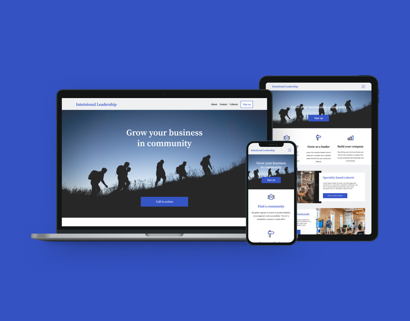
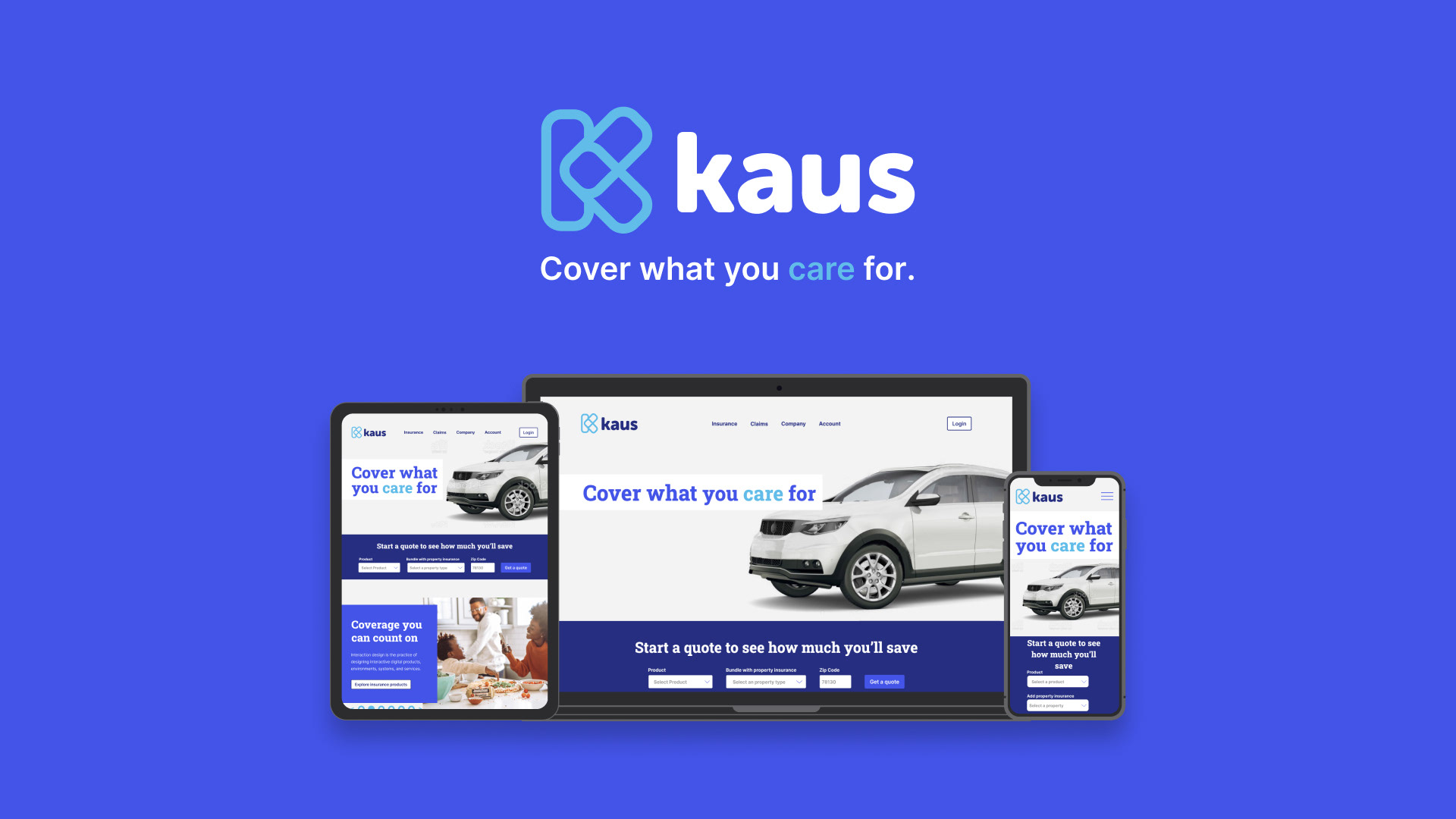
Kaus needed a refresh of their brand as well as a new responsive e-commerce website as they transition from B2B into direct-to-consumer insurance sales.
The Result
A responsive e-commerce site fitted with a approachable information architecture, and an approachable brand to connect with the target audience and solve their needs of an easy insurance purchasing experience.
Tools: Figma, Adobe Illustrator, Adobe Photoshop, maze.co, optimalworkshop.com, Google Workspace
Scope: Responsive website prototype and branding, created for DesignLab's UX Academy
Roles: Art Direction, Product Designer, UX Research, Brand Design

Empathize with the user
Competitive Analysis
My research began with reviewing the existing competitors in the market and the solutions they had created thus far. Overall, no one is really doing internet B2C insurance sales well. Insurance is a complicated topic.

User Interviews
To get diverse insight to this problem, I interviewed 5 people through 1-on-1 in-person interviews. Each conversation lasted up to 15 minutes. My research resulted in 3 key findings:
1. Cost alone was consistently the highest value for each participant.
"Anytime I see a commercial I think 'Could I get that cheaper?'"
2. No one wants to think of insurance more than what is absolutely necessary.
"I honestly don’t use it and check it maybe twice a year"
3. The less insurance is thought of, the happier the person is with their purchase.
"[Insurance is] just a pain to think about. It's a chore."

Define the problem
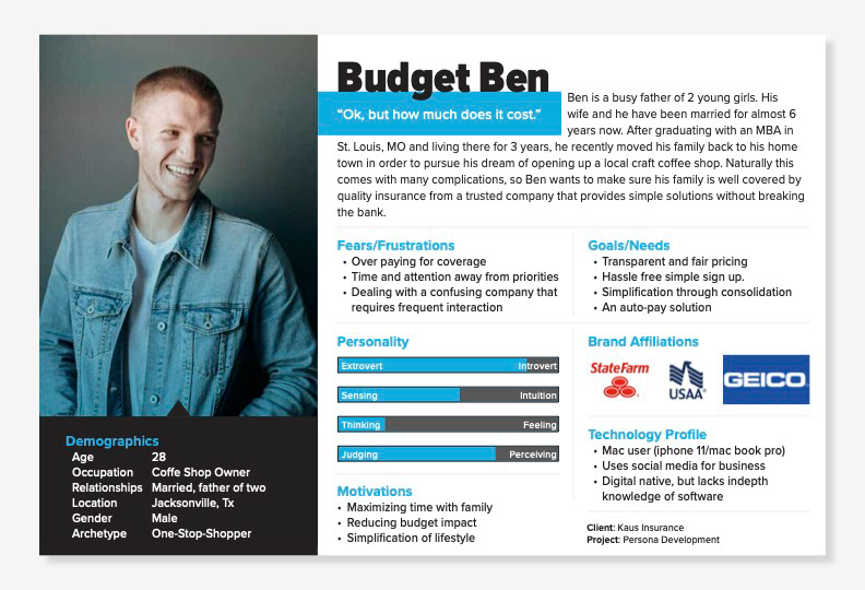
User Persona
I compiled the Empathize research into the user persona of Budget Ben. He is a young professional with multiple – often conflicting – responsibilities (husband, father, business owner).
He is ultimately looking for a transparent, hassle-free, insurance solution that delivers peace of mind and doesn't require his attention.
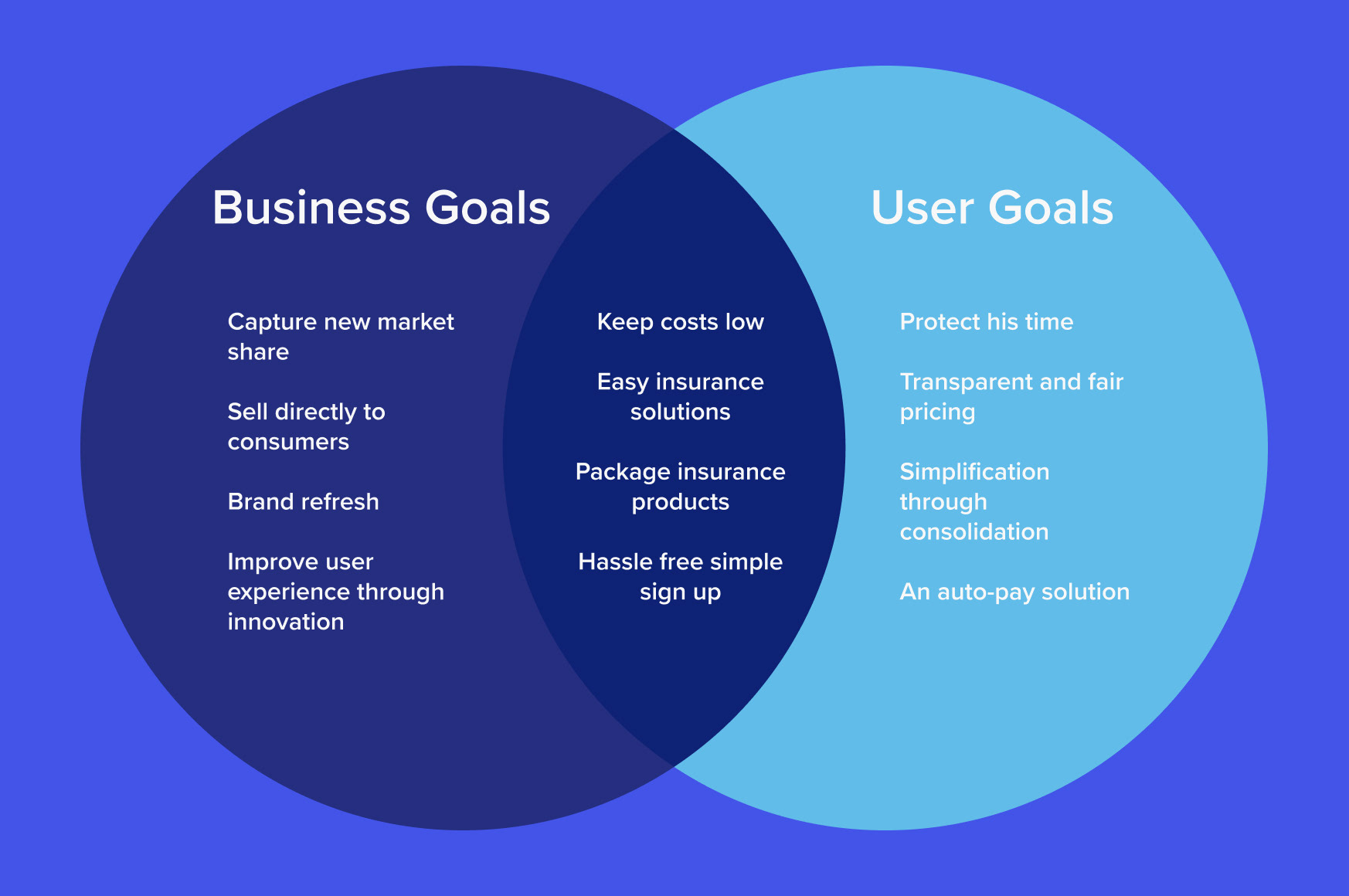
Project Goals
Budget Ben's goals aren't the only one that needs to be considered though. The business goals need to be seen in light of the user's goals. And where there is an overlap there is a design opportunity.
The opportunities include a simplified solution that allows for easy in-and-out navigation, hassle-free sign ups, and simple classification of insurance products. This simplicity will improve user experience and keep costs low.

Ideate potential solutions
Card Sorting
After compiling about 20 items that users could be looking for in their insurance search, I used the website OptimalSort to run a card sorting exercise. Asking people who fit the target user demographics to categorize the different items in whatever way mad sense to them.
3 obvious delineations of content rose to the top:
1. Company (About, Contact, FAQ, etc)
2. Products (various insurance products, insurance bundles, and insurance info)
3. User account (bill pay, account management, update policies, etc)
3 obvious delineations of content rose to the top:
1. Company (About, Contact, FAQ, etc)
2. Products (various insurance products, insurance bundles, and insurance info)
3. User account (bill pay, account management, update policies, etc)
Since "ease of use" was a top user priority I separated out "claims" into their own top level navigation as well. It could have easily fit inside "user account" but filing a claim is frustrating enough without users having to dig through their account to find where to do that. Visibility here was an easy win for usability.
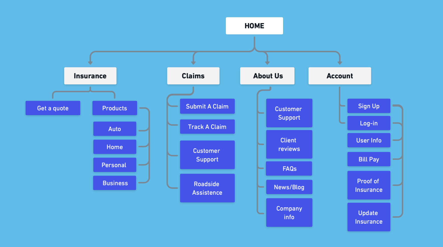
Site Map
This is the structure of the navigation, based on the results of the card sorting exercise.
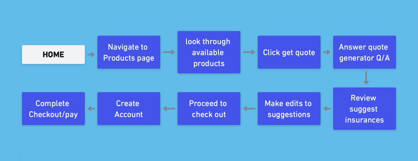
Task Flow
This flow defines the main task the user is wanting to complete and lists all the steps needed to accomplish this task.
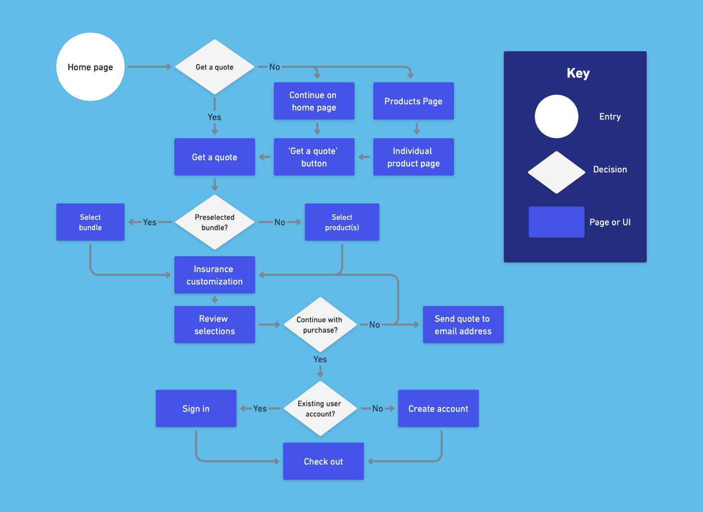
User Flow
This user flow chart shows the potential routes the user could take to accomplish the primary task. Each blue box is a page that would need to be created and optimized for the user to be able to make the decisions (marked by the white diamond).

Design for delight
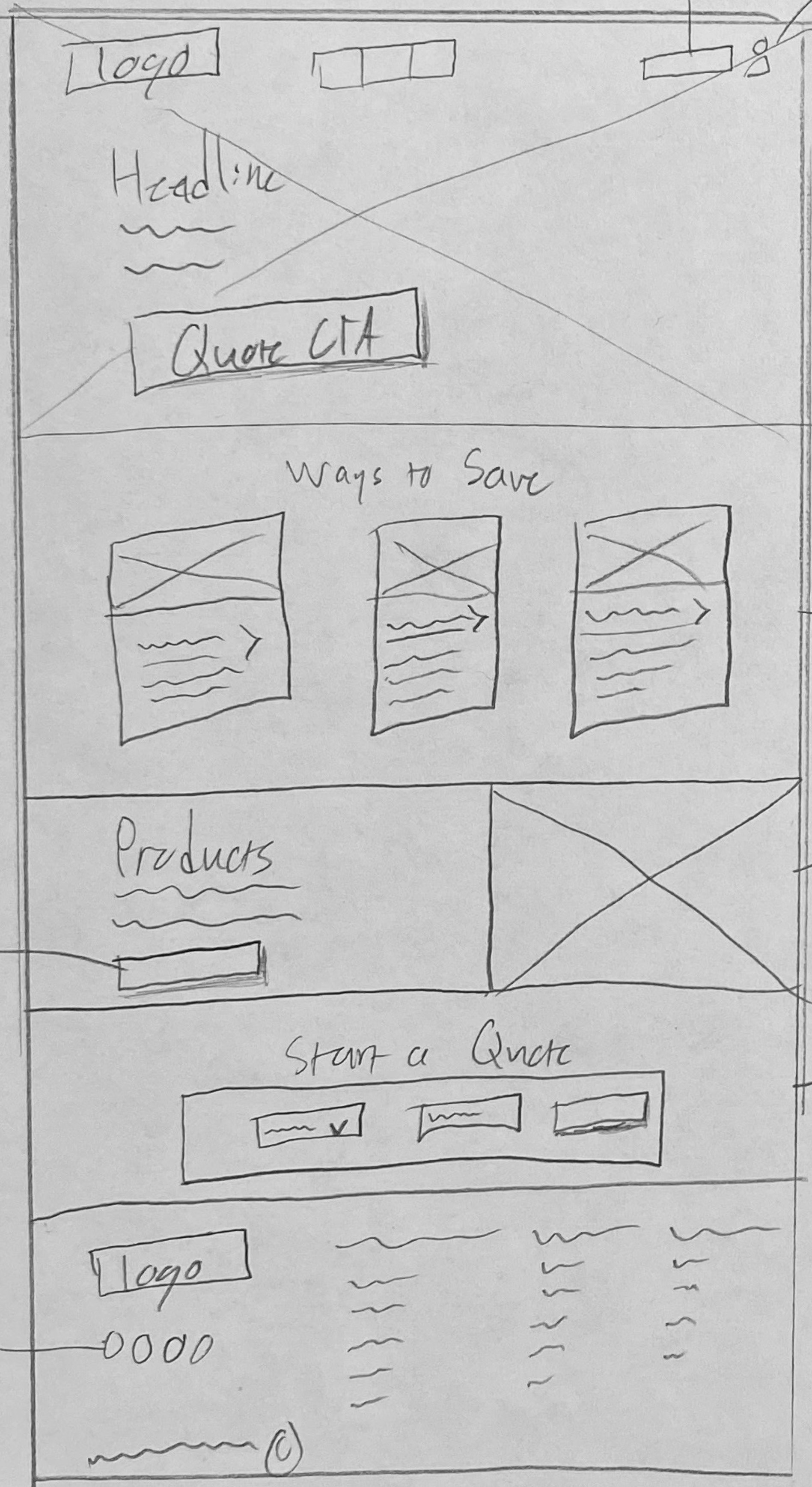
Low Fidelity Mock Up
Starting with low fidelity mockups, I sketch out some initial ideas for the desktop version of the new Kaus homepage. Keeping in mind the task flow and user flow in the call-to-action call outs.


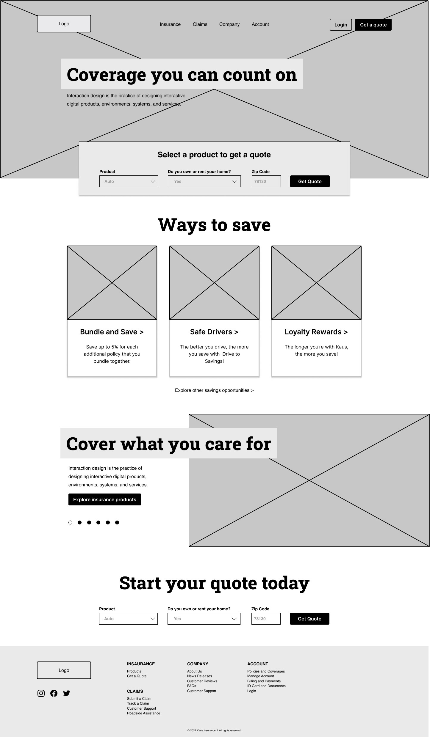
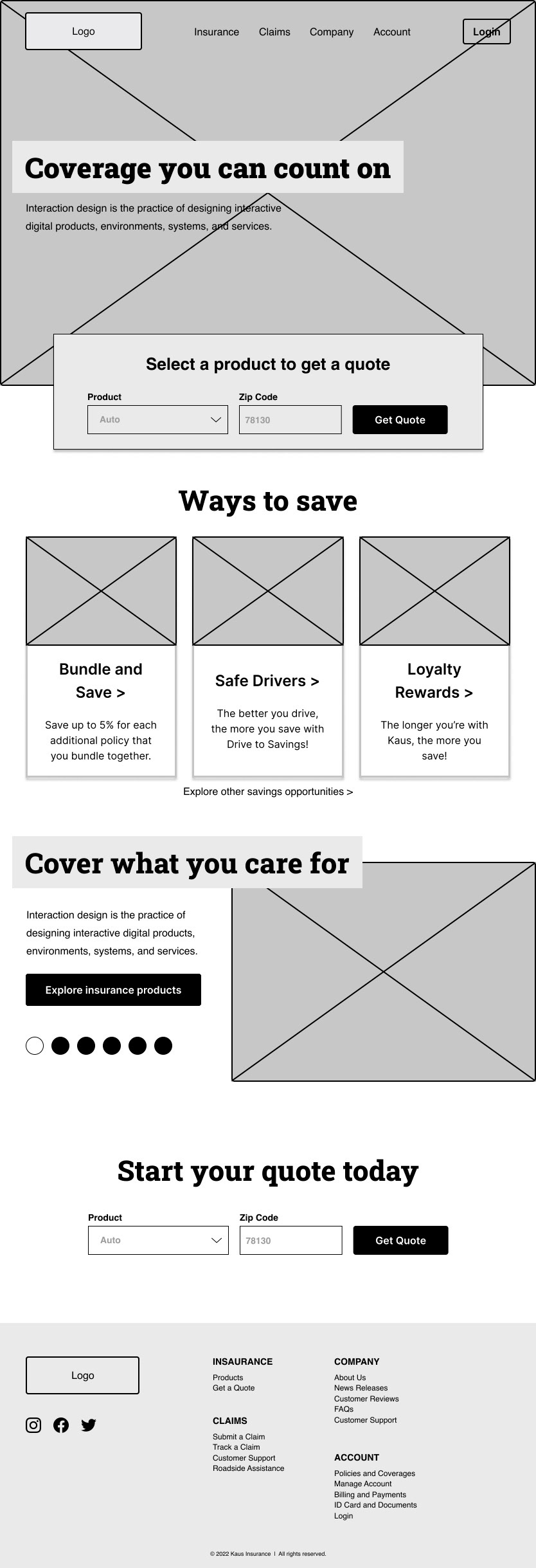
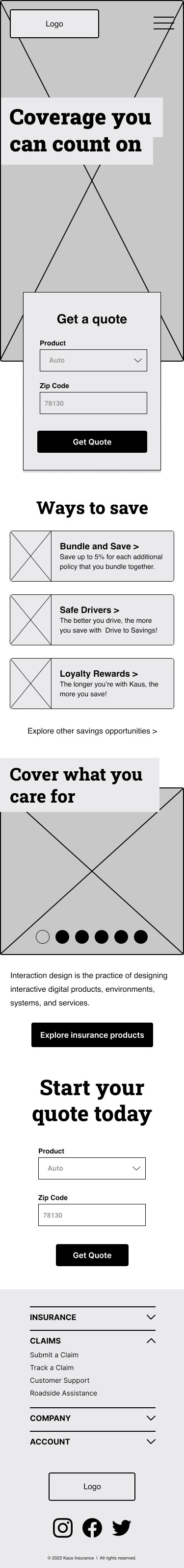
Responsive Wireframes
From the initial sketches I built out these mid-fidelity responsive wireframes. Building out the site in desktop, tablet, and mobile screen so the user experience can be consistent across devices.
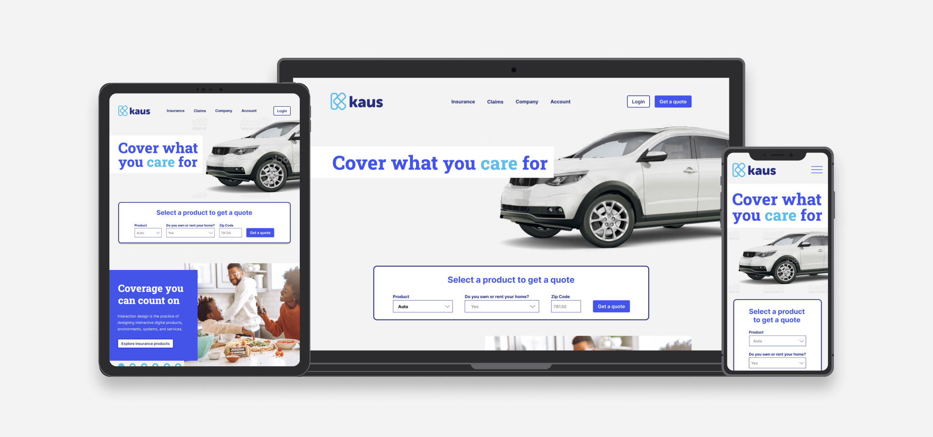
Branding
"Cover what you care for" is the catch phrase of Kaus Insurance. With both that marketing strategy and the desire of the user to have a no-nonsense approach to their insurance, I combined a monogram "K" with a heart shape.

High Fidelity Mock Ups


Test to improve
User Tests
I had 5 participants run through a remote, unmoderated user test via maze.co that was composed of a series of 2 tasks and 4 questions.
All participants completed the tasks, but took different paths. The "quote" module was utilized by every single participant, which was entirely unexpected. Knowing this allowed me to make design iterations to improve that user flow so that the user could more efficiently complete the main task of quoting and purchasing insurance.


Iterate to excellence
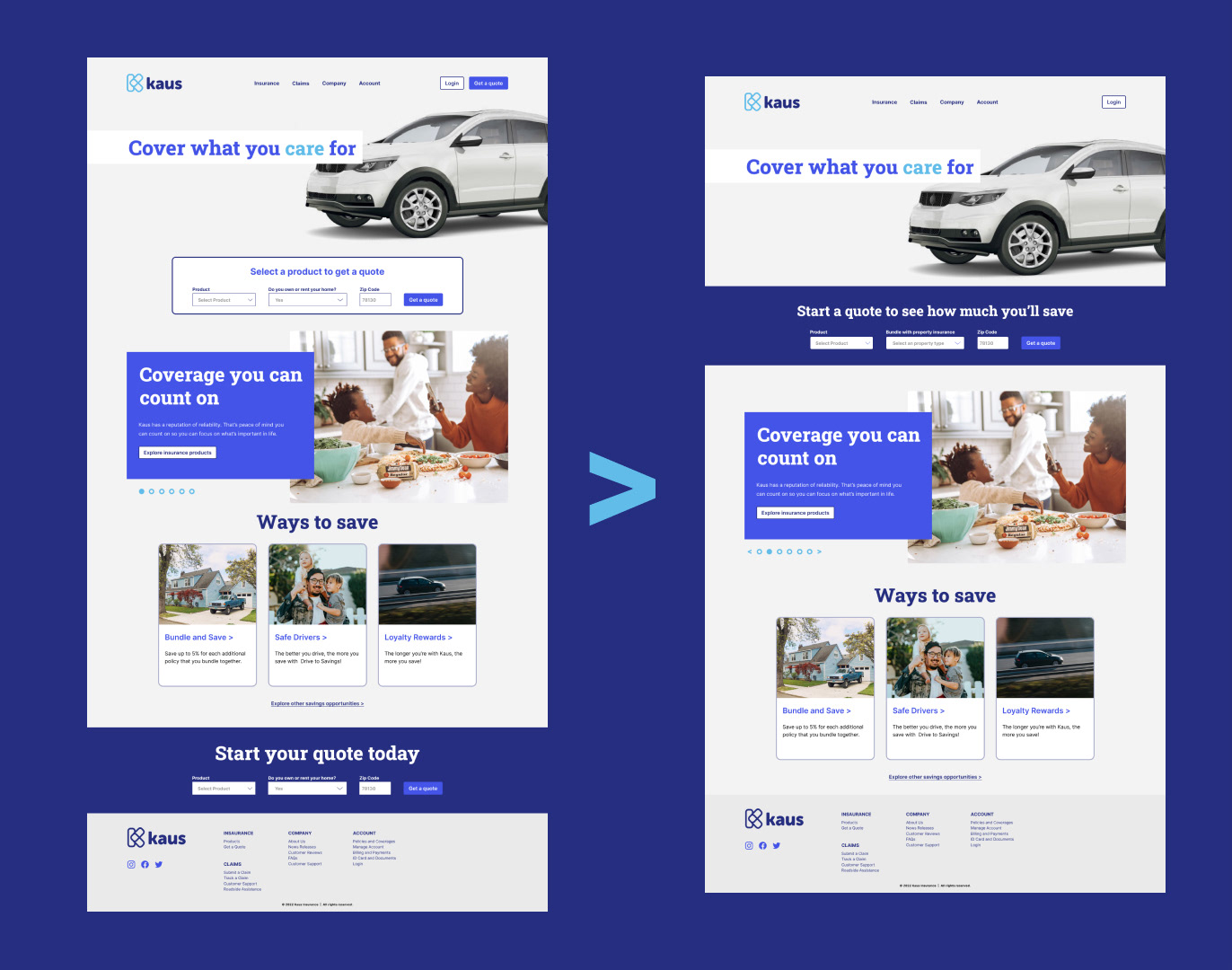
Design Revisions
I removed the duplicate quote section at the bottom of the page, as well as the "get a quote" button on the top right. Reducing redundancy and increasing clarity of navigation (which was an initial a user goal). I also changed the copy, improved spacing, and changed the container to be the entire width of the website.

Conclusion
Insurance is a complicated product, but that doesn't mean the buying experience has to be. Through highlighting navigability and price transparency, the user can use less effort to achieve their task. The result was a simple, beautiful, and approachable e-commerce solution for the business.