The Challenge
Many entrepreneurs feel isolated and overwhelmed in their business. They want connection and leadership, and they are looking to add value to their lives and businesses, and not another task or business meeting.
The Opportunity
By creating a responsive website, Intentional Leadership can connect small business owners together with mentors to help them “build financially successful businesses that harmonize with their lives.”
The Result
A handoff-ready prototype of a responsive website, built in Figma, that was created so implementation could be through custom code or a website builder.
Tools: Figma, Adobe Illustrator, Adobe Photoshop, maze.co, squarespace.com, Google Workspace
Scope: Responsive website created for Intentional Leadership during DesignLab's UX Academy
Roles: Product Design, UX Research
Empathize with the user
Competitive Analysis
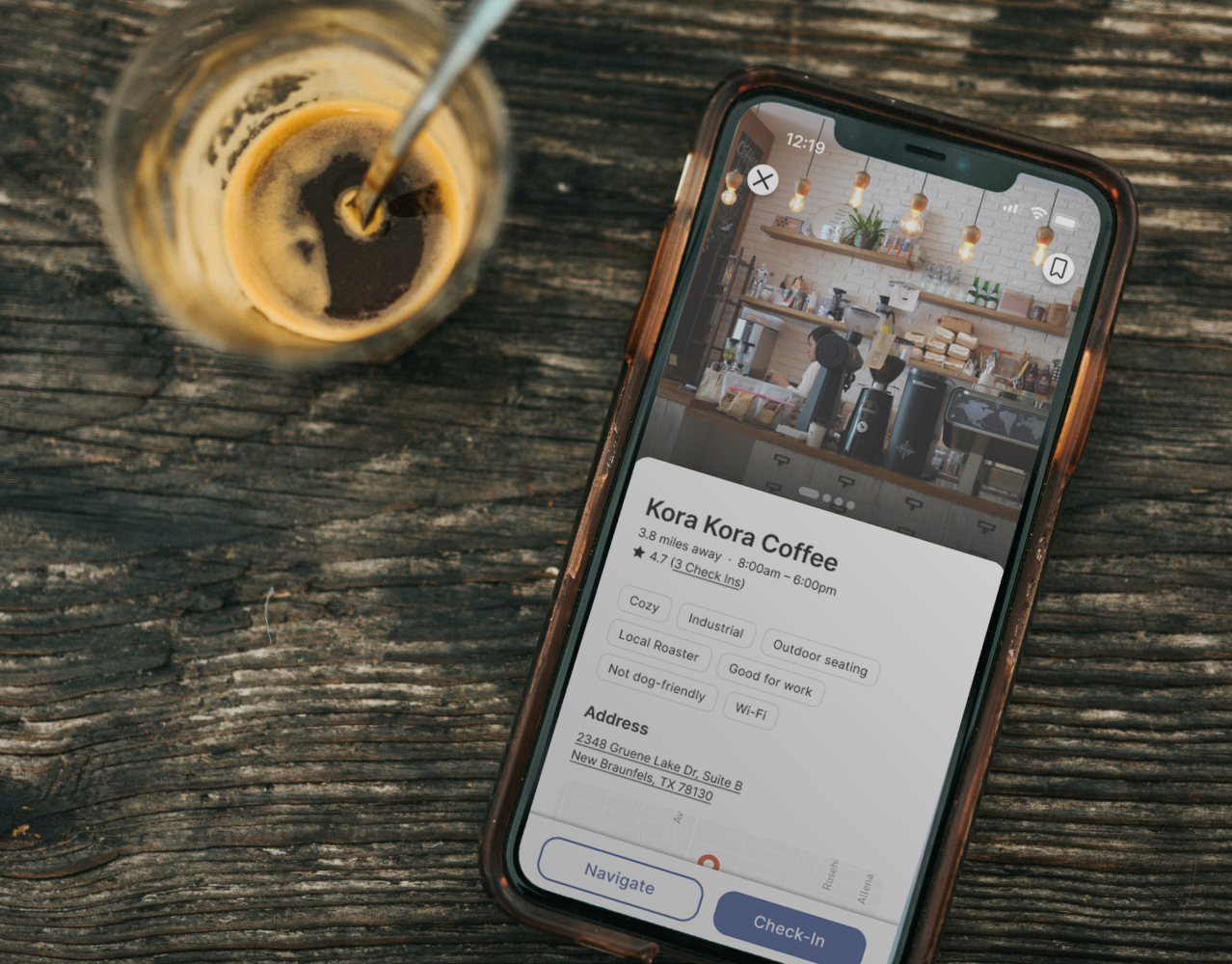
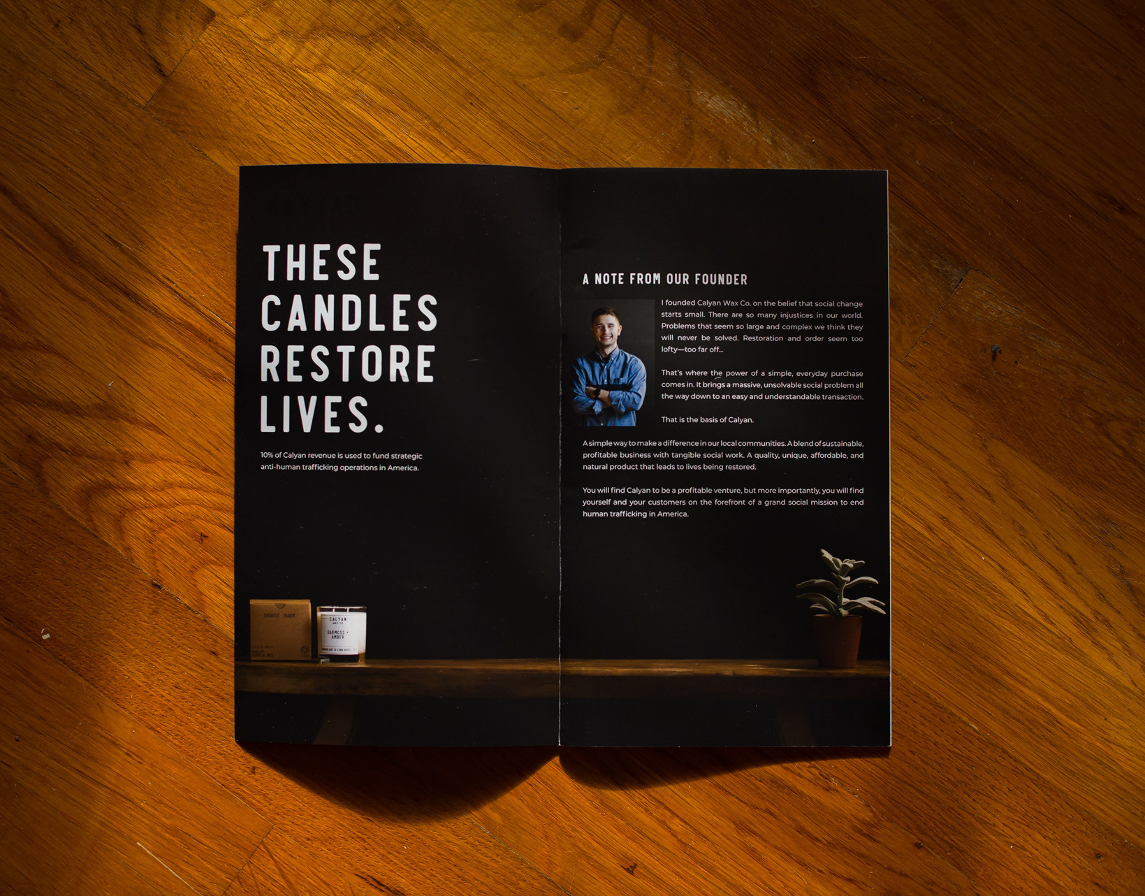
I found that business coaching often revolves around a singular personality or an event-based training like a conference. One cohort model company that stood out was C12. Their website told a coherent story through consistent branding and had a clear information architecture. But their imagery was stereotypical stock photos of business meetings and that made it feel very out of touch.
User Interviews
To gain deeper insights into the experiences of our target users, I conducted four 30-minute phone interviews with small business owners. Through these interviews, it became evident that the business owners experienced feelings of isolation. Despite the success of their businesses, they expressed a sense of "stagnation" in their leadership roles. Consistently across all interviews, there was a common desire for mentorship from individuals who have navigated similar challenges. They sought guidance from those "who have been there," hoping to overcome the perceived "invisible wall" that stood between their current situation and their next steps.
Business owners want connection and leadership. They are looking to add value to their lives and businesses, and not another task or business meeting.
Define the problem
User Persona
In order to organize the insights I gathered from my research in a human-centered way, I created a user persona: Robert. Robert is a small business owner who recently started his own mortgage brokerage.
Product Roadmap
Now that I have my persona, I prioritized the product's potential tools to discern the minimum viable product that addressed Robert’s goals, motivations, and frustrations.
Ideate potential solutions
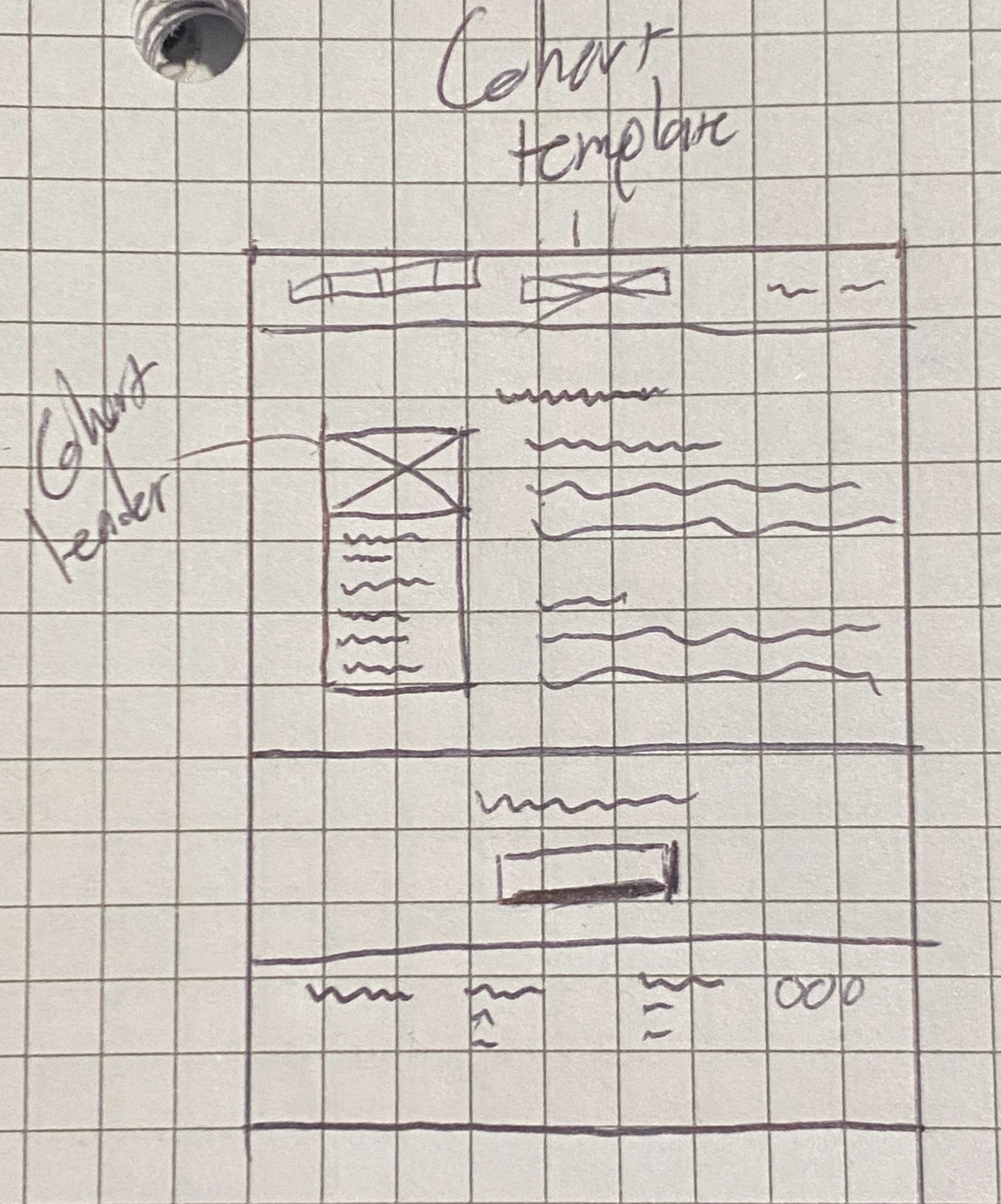
Sketches
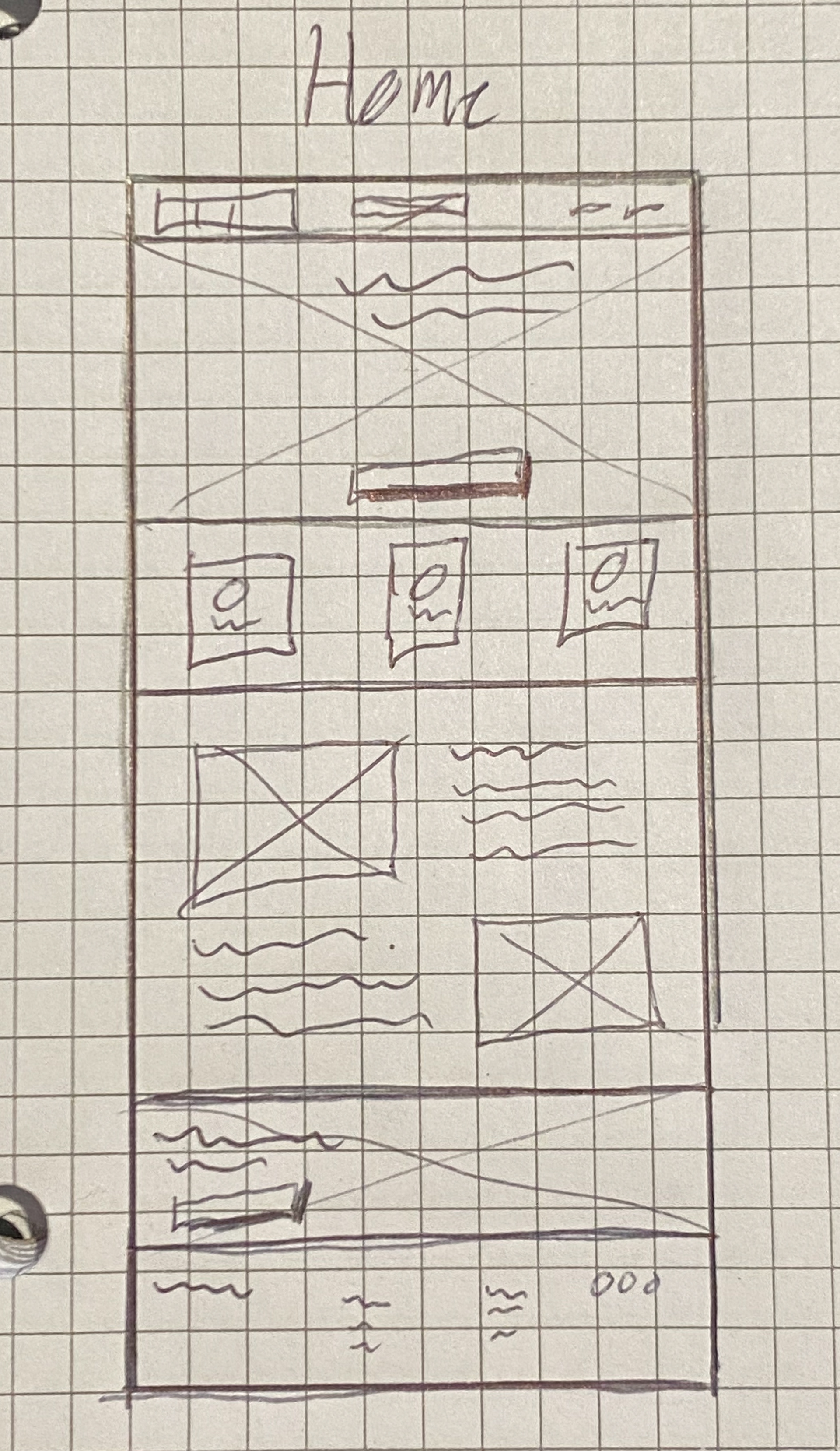
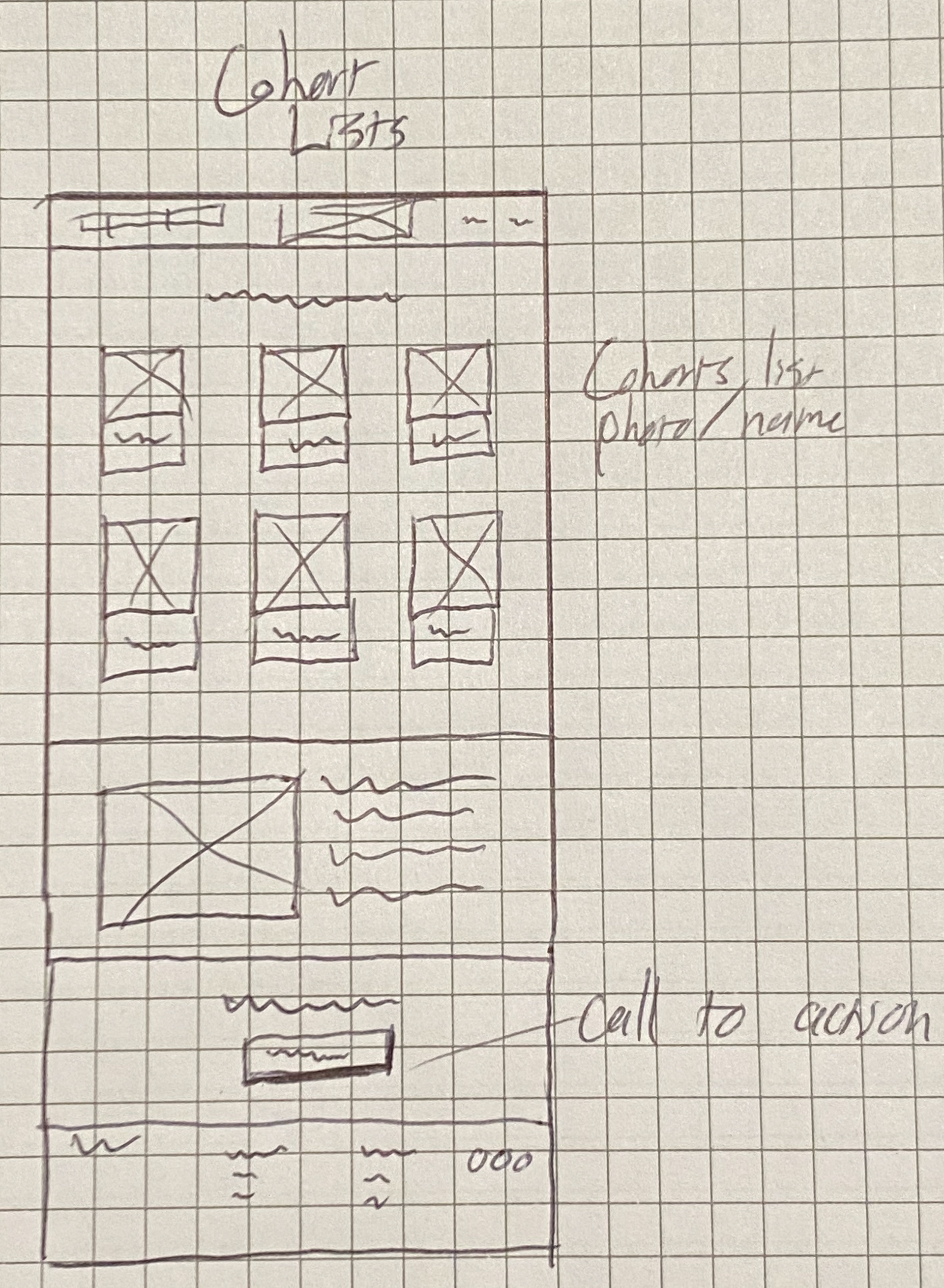
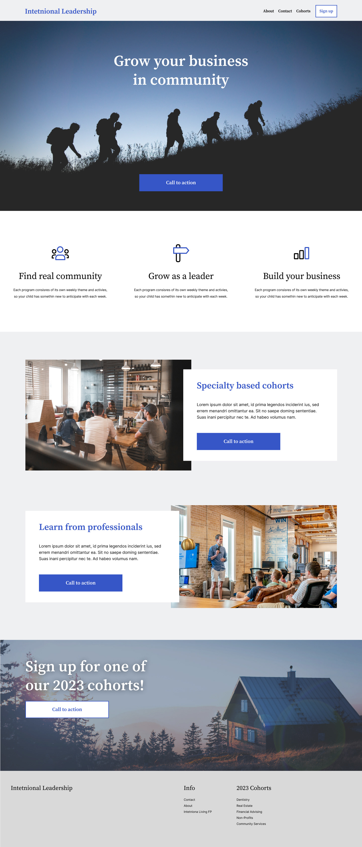
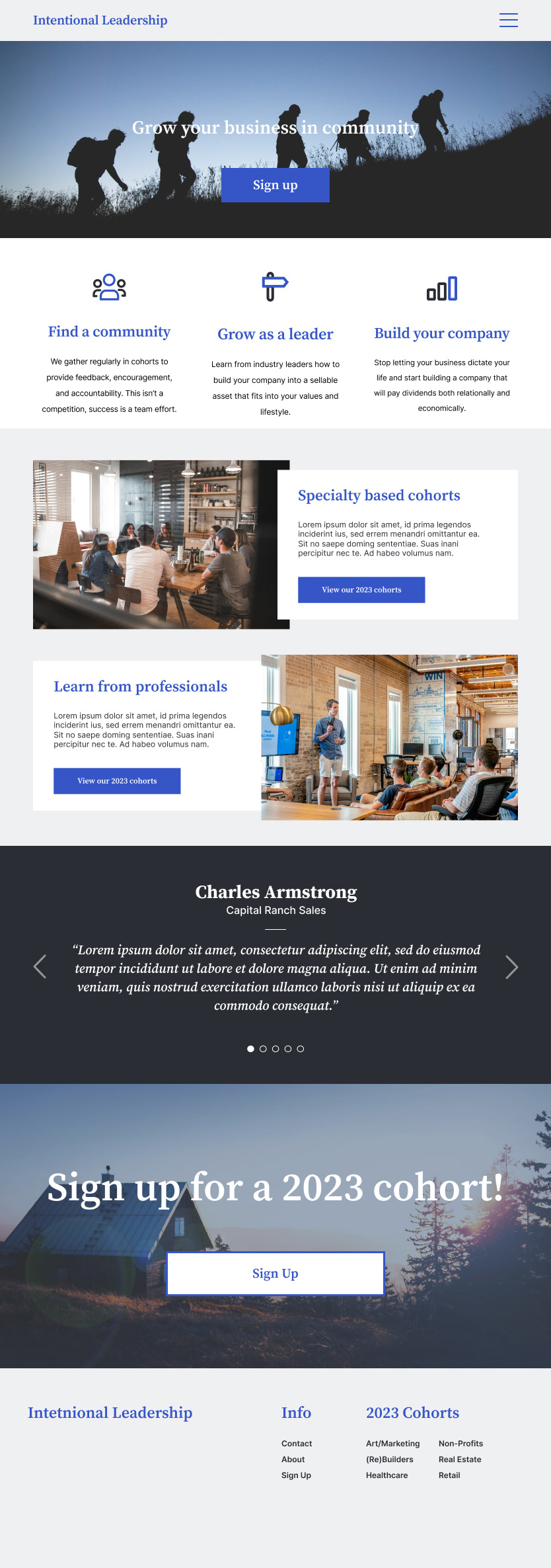
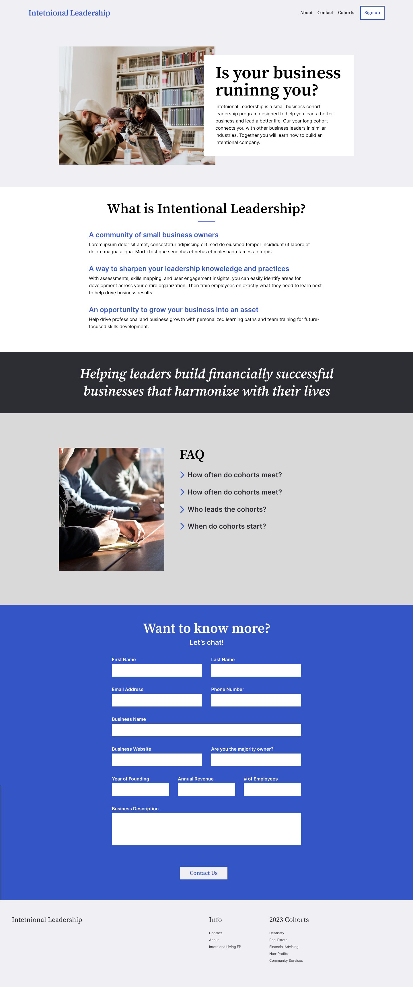
After gaining a deeper insight into the user's needs and priorities, I initiated the ideate phase by crafting a website tailored to address the user's primary objectives, all while aligning with the business's goals of utilizing Squarespace.com for lead conversion. To achieve this, I opted for a minimalist design approach with clear information architecture. Leveraging high-quality photography was a deliberate choice aimed at fostering a sense of community and connection.
UI Kit
Although a full branding workup was outside the scope of this project, I was able to create a UI Kit to enable consistency in current and future web elements. I intentionally built it in a way that could be easily updated if they ever went through a rebrand.
High Fidelity



Test to improve
User Tests
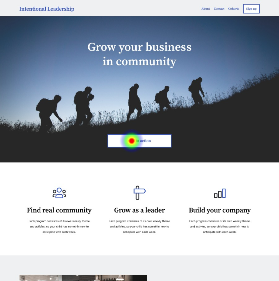
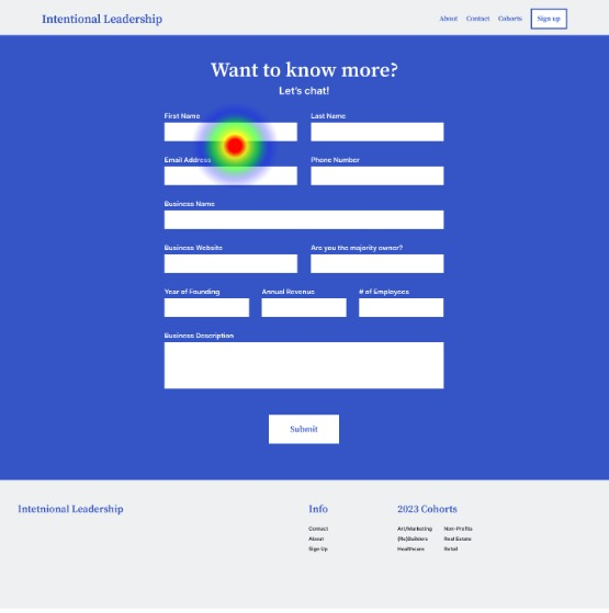
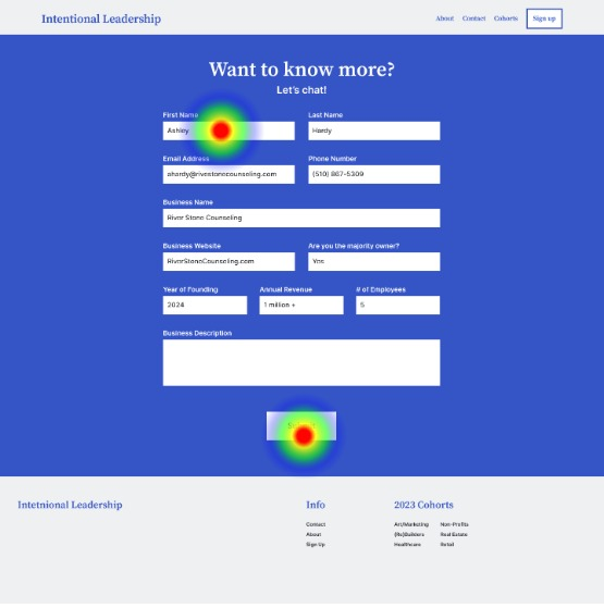
This product's goal was to connect business owners and mentors; so to test that connection, I conducted an unmoderated test of the desktop website prototype using maze.co. The test included four questions and a key task: 'sign up for a cohort.'
All participants successfully completed the sign-up form submission, with each respondent affirming the task's ease by answering 'yes' to the question, "It was easy to accomplish the task of submitting the form."
Iterate to excellence
Iteration
But the test showed that not all of them took the same path. Many of them explored the home page before clicking on the call to action and in fact, in an open-ended question 3 out of the 6 participants specifically requested more information about the program.
From this test, I saw the opportunity to better meet the user’s needs of effectively connecting the user to a mission-focused community by clarifying the process and removing distractions. Particularly, the hover state of the 3 callouts under the Hero image on the home page. My iteration retains the interaction while significantly reducing the impact of the animation to reduce emphasis and therefore confusion.
Original Hover-state
New Hover-state
Conclusion
The final result is a prototype that is ready to go into production! Ultimately Intentional Leadership changed their business strategy so this website never saw implementation. However, the discovery process helped us both better understand the target user’s goals and motivations for joining a business mentorship cohort.
Had the website gone public, I would want to iterate on the sign-up experience. I would want to know about the business owners' experiences with the sign-up form. Other than user interviews, I would implement an A/B testing strategy to see which approach leads to greater amounts of sign-ups on the website.

